
Tonnemaker Valley Farm
Rebranding a Woodinville family farm
OVERVIEW
Tonnemaker Valley Farm is an organic produce and cut flower farm in Woodinville, Washington. I originally designed their identity in 2017 and returned to it in 2026, evolving the original concept into a more distinctive and versatile brand system.
role
Freelance designer
TOOLS
Adobe Illustrator
Adobe Photoshop
DELIVERABLES
Logo package

EVOLUTION OF THE 2017 logo
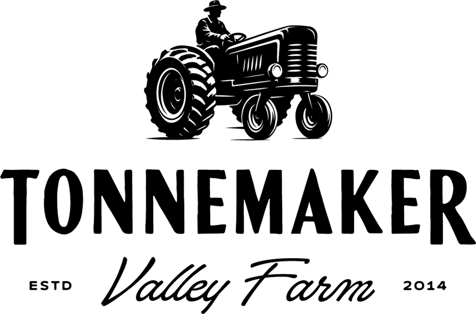
The 2026 refresh builds on the character of the original identity while creating a more flexible system. A more detailed tractor mark, expanded typography, and multiple logo configurations give the brand greater range across signage, packaging, print, and digital applications.


PRIMARY LOGO
CHALLENGE
Decide what to keep.
Give it room to grow.
Returning to the identity I designed in 2017, I wanted the refresh to retain the farm’s character while working across more formats. I kept the tractor as the visual anchor and focused the update on its detail, typography, and range of lockups.
APPROACH
Refine the mark.
Strengthen its character.
I developed a more detailed tractor mark and expanded the typography around it. My focus was on evolving the existing identity into a more distinctive system while preserving a clear connection to the original design.


SECONDARY LOGO


LOGO MARK

SOLUTION
A more versatile logo suite for varying applications.
I built out a primary lockup, a secondary script, a standalone tractor, and badges. Each gives the farm a different way to use the identity, from larger signage to compact packaging and digital placements, while retaining the same visual character.

COLOR
Pine
Oat
Coal
Sage
Barn wood
TYPE


